

This Is the Reason Why Road Signs Are Designed in Different Shapes
Updated: Mar. 28, 2022
Hint: It has to do with potential danger ahead of you!
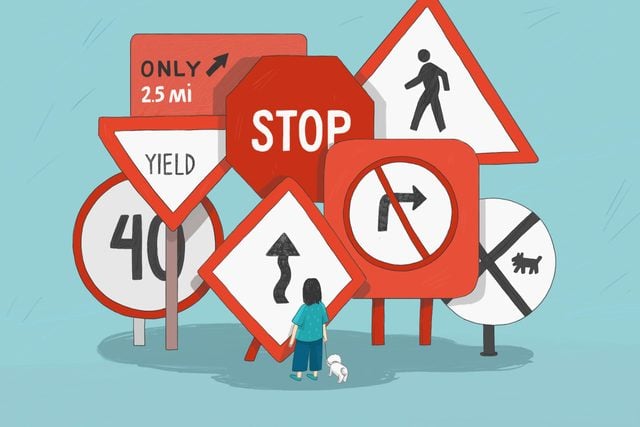
Yield signs kind of look like “Y’s,” if you’re really looking to make some connection there. And railroad signs are circular because trains have circular wheels, right? And roundabout signs are shaped like diamonds because… actually none of this rationale makes sense. (And these 18 funny road signs DEFINITELY don’t make sense—but you’ll still want to stop for them.)
As it turns out, there is a specific and pragmatic reason behind the shape of each common road sign, but the shapes didn’t always carry significance. This all changed in 1923 when a part of Mississippi’s highway divisions decided to create a formalized system for the posts and sheet metal of the U.S. transit infrastructure.
The number of sides indicates the level of potential danger up ahead; the fewest number of sides being three (i.e.: a Yield sign), with the unlimited number of sides on a circle representing the maximum amount of perilous potentiality (i.e.: a Railroad sign). The exception to the more-sides-equals-more-danger-maxim is the rectangular sign, which is used strictly for informational purposes.
Although the DMV website does not mention the corner/danger correlation, the history still has some pretty interesting significance.
Now that you know why road signs are all different shapes, make sure to brush up on these 11 driving etiquette rules you’ve probably forgotten since Driver’s Ed.