

Using THIS Color on Instagram Will Get You More Likes, According to Research
Updated: Jun. 11, 2017
Can you guess what color is most likely to get a double-tap?
When followers are scrolling past your image on Instagram, you’ve got about a second—if you’re lucky—to grab their attention. But research shows the colors in your picture could make people more likely to double-tap instead of scrolling by.
People make judgments within 90 seconds of first seeing a person or product, according to a study in the journal Management Decision. That’s decades in the world of mindless scrolling, but the study also found that 62 to 90 percent of that judgment is based on color. So there’s a good chance the colors in your ’Gram make a big difference.
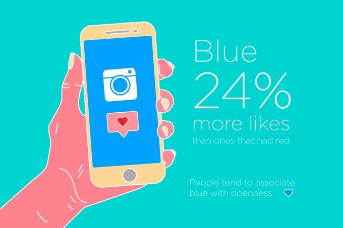
Visual analytics and marketing platform Curalate took things a bit further and analyzed 8 million Instagram photos to figure out which colors get more likes than others. Mostly-blue images got 24 percent more likes than ones that had red as the most prominent color.
Just putting in just a pop of color might not suffice though. Photos with just one dominant color get 17 percent more double-taps than ones with more than one main color, according to the study. But only 10 percent of the images in the study actually had a single prominent color.
It could be that blue images are more likely to have peaceful oceans, awe-striking skies, or pretty flowers—all things worthy of a heart. Make them pop even more with these smartphone photography tricks.
Or people might like blue images on Instagram because, well, they like blue, says Daniela Niesta Kayser, Dr. phil., professor of social psychology at University of Potsdam. One study from her department found that blue was the favorite color of college students.
People tend to associate blue with openness, so they’re more likely to want to stay in contact with that color, according to a study in the Journal of Experimental Social Psychology. Red, on the other hand, can signal danger and mistakes, the study found.
“Red is context-dependent in its effects,” says Dr. Niesta Kayser. “Whether red yields a positive or negative reaction is primarily dependent on the context in which it is presented, paired or perceived.” For instance, a red dress might make you feel sexy as heck, but seeing your boss’s red marks on your proposal could trigger major anxiety.
At the end of the day, though, we encourage you to just be creative and post what makes you happy. If those strawberries you ate at lunch were luscious, healthy, and downright photogenic, post that pic. Your Instagram page is about making yourself proud—not satisfying other people. Just keep these things never to post about your relationship off your page.