

Here’s Why Disney World Uses Purple Traffic Signs

Updated: Jan. 13, 2023
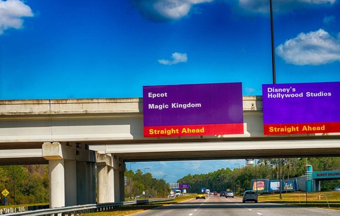
You won't find an ordinary green-and-white traffic sign around Disney World. Here's the story behind the fun purple-and-red signs that the park uses instead.
If you’ve ever been to Disney World, you probably noticed that the park pulls out all the stops to make guests believe that it is truly its own “world” and that they are leaving the ordinary behind. And this Disney magic isn’t confined to the park itself—you’ll even see hints of it in the area surrounding the Disney property. One way Disney World distinguishes itself from the rest of the world is with its traffic signs. You won’t see a humdrum green-and-white road sign on Disney property. Instead, whimsical purple-and-red signs will help guide your way to Disney World parks, hotels, and attractions. The moment you catch a glimpse of those signs, you know that your Disney adventure is beginning. All Disney fanatics should know these 23 secrets that the park employees won’t tell you.
But the colors of those signs—primarily purple with white text, with a red strip containing yellow text across the bottom—aren’t an arbitrary combo of fun colors. They were carefully chosen by Deborah Sussman, a celebrated graphic designer. Disney Development Co. reached out to Sussman’s company, Sussman/Prejza & Co., in 1989, requesting a traffic sign design for their ever-expanding park. According to the company’s description of the project, the signage was to be “unique in spirit, clean, easy to follow, and capable of being expanded.”
So Sussman drew inspiration from something that was, indeed, unique to Disney—its best-known character, Mickey Mouse himself. The Disney podcast Mouse Chat calls the color combo “an abstract view” of Mickey’s color scheme. The basic structure of the signs, predominantly a dark color with a bit of red and yellow at the bottom, calls to mind Mickey’s black fur, red pants, and yellow shoes. This is especially apparent in the smaller signs, many of which have the actual iconic mouse ears at the top! Check out these surprising facts you never knew about Disney’s most famous characters.
The reason Sussman chose to swap out black for purple isn’t known for sure, but there are plenty of valid guesses to be made. For one thing, a primarily black traffic sign would be tough to see at night. For another, purple is just a less common and more, well, colorful choice than black, while still being in the same family of dark colors. Disney YouTuber Midway to Main Street speculates that Sussman chose purple in particular because it’s the complement of yellow, which already featured in the design. You’ll also see a light, sea-foam tint of red’s complementary color, green, in the posts supporting some of the signs.
It all just goes to show the extreme amount of detail that goes into every aspect of the Disney World experience!
Originally Published: March 06, 2019