

The Real Reason the McDonald’s Logo Is Yellow and Red

Updated: Mar. 28, 2022
There’s a little bit of science behind why the golden arches are golden.
If you’re anything like us, it seems that your stomach starts to grumble as soon as McDonald’s golden arches come into view. The reason behind that isn’t the mouthwatering taste of their delicious fries—this is how they get them to taste so good by the way—it’s actually psychological, and it has to do with the colors of their logo.
The history of the McDonald’s logo
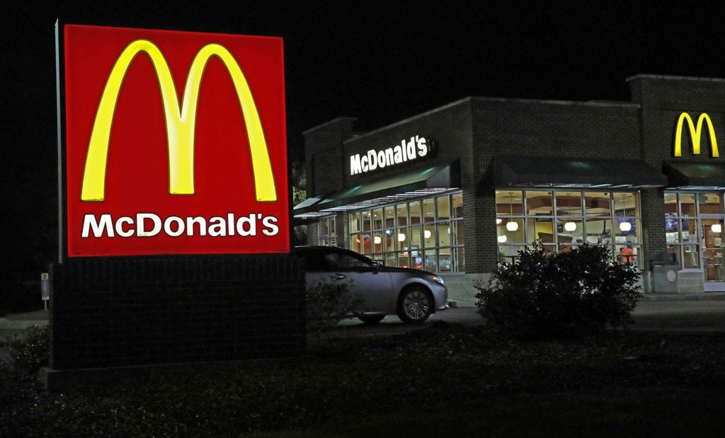
No one thinks of the golden arches without thinking about McDonald’s. The McDonald’s logo has slightly changed over the years before they settled on what it still is today in 2003. Shortly after the very first restaurant opened, the architect Stanley Clark Meston was hired to update the building. He incorporated two large golden arches on either side of the building that came through the roof and into the sky. When Ray Kroc took over the business in 1961 he created a logo that incorporated the two golden arches to form an “M” for McDonald’s.
Why red and yellow?
The colors red and yellow were chosen for a specific reason—and no, it wasn’t because they looked nice with Ronald McDonald’s clown-like face. It actually has to do with science. The color red is stimulating and is associated with being active. It also increases heart rate, which helps to jumpstart your appetite. The color yellow is associated with happiness and is the most visible color in daylight, so that’s why a McDonald’s logo is so easy to spot on a crowded road.
The brain processes color before it processes words or shapes, so that’s why the fast-food chain chose these two colors for their logo and brand. Red and yellow makes you hungry, encouraging you to want to buy the product they sell, while also making you feel happy. But McDonald’s color psychology isn’t the only way they make money—the real way they make money doesn’t even have to do with their food.
Where else does McDonald’s use color to draw customers in
McDonald’s has started to use this color philosophy to influence and change the way people currently think about their brand as well. Many franchises in Europe have started to incorporate more of the color green into their storefronts and interior design because it’s associated with nature and being environmentally friendly, something McDonald’s has been criticized for not being in the past. The company has been working to become greener by using environmentally friendly refrigeration and converting used oil into biodiesel fuel.
So, next time you pass a McDonald’s logo, don’t be surprised if you find it really hard to resist going in and getting a burger and coke. Next, don’t miss these mind-blowing facts you never knew about McDonald’s.
Originally Published: July 18, 2019