

The Hidden Detail on the Starbucks Logo You Never Noticed Before

Updated: Apr. 16, 2024
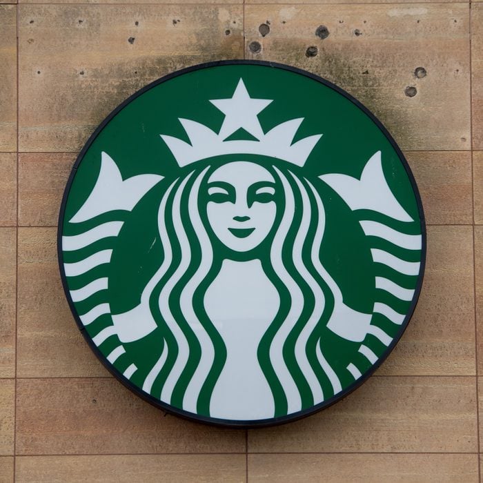
If you look closely, you’ll notice one small imperfection in the iconic Starbucks logo.
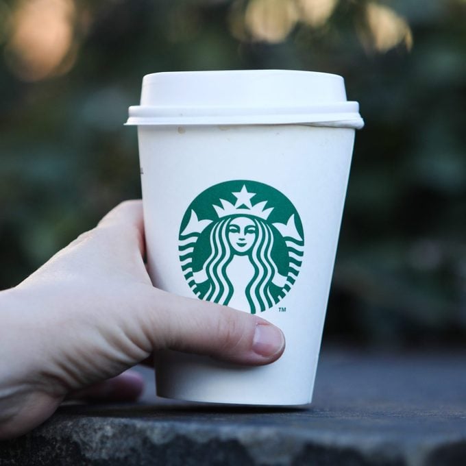
Some like their coffee bold and black, while others take it sweet and sugary. No matter your preference, you’ve probably glanced at the iconic green Starbucks logo and had a craving for caffeine (or maybe one of those Starbucks Refreshers). Catch sight of the green Siren with her long, wavy hair, and you’re instantly transported to latte-with-extra-whipped-cream heaven. But there is a surprising hidden detail on this famous logo—and you’ve probably never noticed it before. There are many secret messages in company logos you may have missed—including the Baskin Robbins logo and the 7-Eleven logo—and Starbucks is no exception. According to the team that redesigned the image in 2011, one last-minute decision made all the difference. Then, read up on the interesting history of the Pringles man and how he became their mascot.
The history of the Starbucks logo
That mythological creature that resembles a mermaid in the center of the Starbucks logo is actually a Siren. According to Starbucks representative Tyler Krivich, “Starbucks’ name comes from the author Herman Melville’s Moby Dick novel, but the famous Siren logo was discovered while scouring old marine books.”
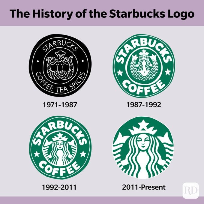
In 1971, when the founders of the coffee chain decided on the name Starbucks, the nautical being stood out. Since the original home of Starbucks is the port city of Seattle and coffee beans typically travel overseas on large container ships, the Siren seemed most appropriate.
The logo has gone through changes over time, including its color (from brown to green) in 1987, followed by a more modern adaption in 1992 when Starbucks became a publicly traded company. But the most prominent change of all happened in 2011.
The Siren received a full makeover. Her hair became a little more modern-looking and she had some work done on her face. The words “Starbucks Coffee” were also removed from the logo, as people saw the Siren and immediately associated it with the coffee chain. However, nothing about this Siren is “perfect.” Keep up with your Starbucks knowledge and check out these things Starbucks employees won’t tell you.
The hidden detail in the Starbucks logo
During the Siren’s makeover, which smoothed out all of her imperfections, her face became more symmetrical. But, after several attempts, the team was still not satisfied. “As a team, we were like, ‘There’s something not working here, what is it?’” global creative director Connie Birdsall told Co.Design. “It was like, ‘Oh, we need to step back and put some of that humanity back in. The imperfection was important to making her really successful as a mark.”
Although you might not see it right away, there is a slight asymmetry in the Siren’s face to this day. Look closely: You’ll notice that the right side of her face has a bit more shadow, and her nose dips slightly lower on the right than the left. “It felt a bit more human and felt less like a perfectly cut mask,” design partner Bogdan Geana said.
So, there you have it. Even Starbucks says that imperfection is beauty. Now go treat yourself to a latte! But before you go, make sure you know the difference between the Starbucks coffee sizes so you can order like a pro.
Sources:
- Starbucks: “Who is the Starbucks Siren?”
- My Recipes: “The Starbucks Logo Is Actually Asymmetrical, Just as Its Designers Intended”
Originally Published: July 19, 2021