

The Hidden Detail on the Baskin Robbins Logo You’ve Never Noticed


Updated: Apr. 13, 2022
Can you spot the Baskin Robbins logo's clever "secret"?
I scream! You scream! We all scream for 31 flavors of ice cream! The popular ice cream chain Baskin Robbins is known for their long list of delicious flavors and pink spoons. But have you ever taken a closer look at their logo? There’s something hidden in it, and it’s not the only logo with hidden imagery. There are many secret messages hidden in company logos that you may not have noticed before, including at Starbucks and 7-Eleven. So what’s hiding in the Baskin Robbins logo?
The history of the Baskin Robbins logo
Ice cream runs in this family. A year after Burt Baskin opened Burton’s Ice Cream Shop in Glendale, California, in 1945, his brother-in-law, Irv Robbins, opened his own ice cream shop in Pasadena. Unsurprisingly, it didn’t take very long for the two to merge their businesses.
Baskin and Robbins created Baskin Robbins in 1953. Their shop offered 31 flavors so that visitors could theoretically come back each day of the month for a new flavor. At the time, it was rare to offer as many flavors as they did, and they wanted to brag about it in their logo and on their storefronts. The number 31 proudly stood out from the name with “31” written above “Baskin Robbins Ice Cream.”
This remained the signature logo for Baskin Robbins until 1991, when the names “Baskin” and “Robbins” sandwiched the number 31. This is also when they first introduced the pink and blue color scheme.
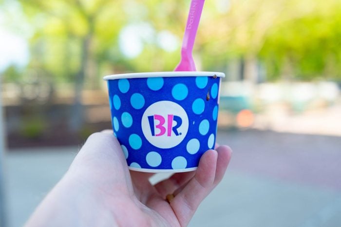
The logo was then modernized in 2006, but it still included the number 31; it’s just a little more camouflaged. Now that you know that, can you see it? The pink parts of the B and R make up the number 31. Learn why so many logos use red (like Coca-Cola) in their branding and how colors influence us.
![]()
Where is the 31 in the Baskin Robbins logo now?
In 2022, the Baskin Robbins logo got its most current makeover since 2006. The new logo is a less playful version of the one prior. The designers have swapped out blue for brown and the font is a bit more modern. But the logo still reflects the important number 31. Like the previous logo, the 31 makes up the pink part of the letters B and R. Can you see it? Although 31 flavors isn’t as breathtaking as it was all those years ago—Baskin Robbins has actually created over 1,000 flavors as of today—the 31 still remains an integral part of the company’s roots.
It’s OK that you were too consumed with your ice cream to notice this fun quirk. We were too. Next, see how your personality traits are linked to your favorite ice cream flavor. Then, read up on the interesting history behind Pringles’ mascot.
Originally Published: April 13, 2022